Nothing unites the internet quite like a catastrophic rebrand. From Cracker Barrel to Jaguar, there have been plenty of disastrous rebrands across the years that are truly WTF worthy – and now we have another to add to the list. May I present the new Pirate's Booty logo.
With a brand name like that, I was already slightly concerned about what the new look would entail, but thankfully, the snack brand hasn't gone down that route. Instead, the new logo's modern upgrade has sparked backlash among design fans, becoming yet another victim of the great blandification war.
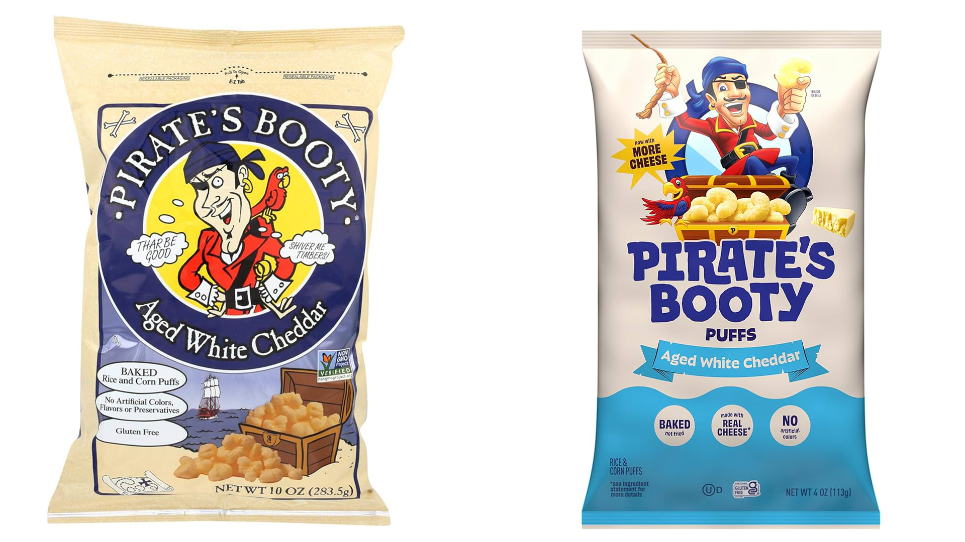
While certainly of the time, the old Pirate's Booty logo had its charm, featuring a parrot-shouldered pirate protecting a treasure chest of 'gold' (puffed corn and rice to you and I). Paired with charming packaging illustrations and an appropriately scrawly typeface, the packaging carried a playful energy that was perfectly on theme.
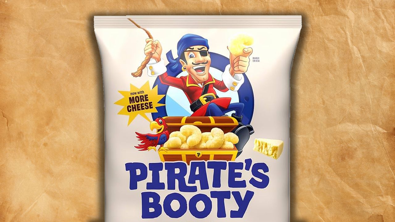
Could it have done with an update? Yeah, sure. But maybe not this. The new logo features a cartoon, clipart-style image of the old pirate, with a brand-new sans-serif font that strips the brand of its salty seadog personality. Admittedly, it's inoffensive, but that's the problem. All the pizazz of the old branding is wiped, and what's left is just another overly polished contemporary brand.
As with all controversial rebrands, Pirate's Booty was subject to the dreaded AI allegations, and while I personally see this as the work just some miscalculated modernisation, Redditors were quick to pick apart the new look. "Picture is in the AI trash style, but nothing to give it away one way or the other. Either way, it is a pointless downgrade on the graphic design front," one critic wrote, while another added, "They've also got the modern comics coloring problem of trying to do realistic shading on something that shouldn't have it. Let them be flat colored!"
For more branding news, check out why Starbucks' catastrophic branding fail can't all be blamed on AI or take a look at Why traditional branding systems are dead.