Marketing is a magic trick—it can make people believe that a product is everything it isn’t. Does this include something as essential as water? According to Matt Rosenman (@matrosenman), a marketer, even water could be rebranded as an “unhealthy” item if a brand tried hard enough.
Recommended Videos
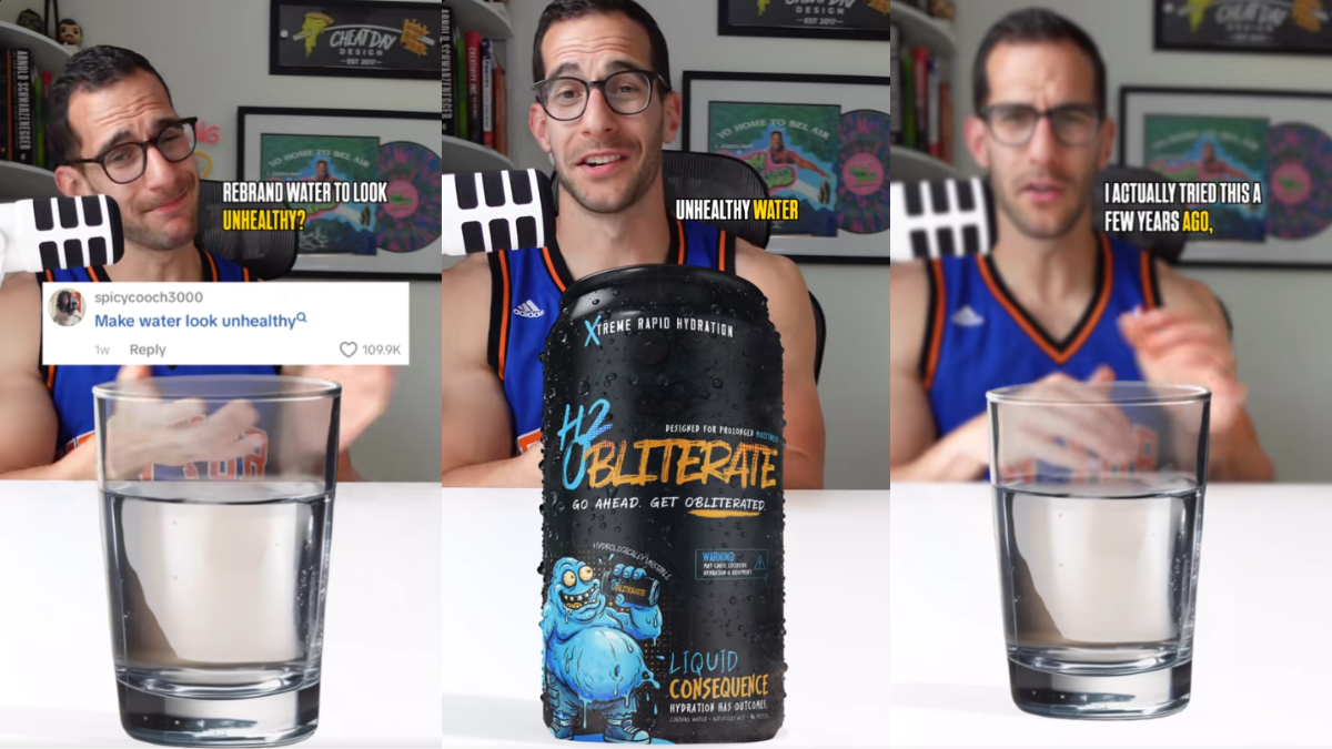
“I actually tried this a few years ago,” Rosenman said on his video. It was a challenge to see if he could make water seem unhealthy, which seemed extremely difficult. Water being a mystery goop that nobody wants to drink reads as a fundamental contradiction. Water—not coffee, juice, or soda—is what people look for when they’re feeling under the weather or coming from a heavy workout session.
“We can’t really make water seem unhealthy because it’s just water,” Rosenman said. But what he did was play around with the packaging of water to make it seem like it is the case.
He started off by designing a black soda can. The shape of the packaging implies that a carbonated drink is what’s encased in it, which means it must mean that it’s terrible news for the stomach.
It’s all a marketing gimmick
“I’m going to give this can a ’90s/2000s skate vibe, because the branding back then was kind of gross,” he said. But it also seems largely reminiscent of what Monster energy drinks go for in terms of overall looks. It’s great for keeping people awake but awful where palpitations are concerned.
“Calling this water is not going to fly, so I’m going to call this drink H₂Obliterate,” he commented on the rebrand. Rosenman also decided to put “hydrologically unstable” on the can. Any basic chemistry class would teach that H₂O is just water and that the element is not stable.
Putting “Obliterate” in the branding makes it all seem like the water is corrosive. But it also goes to show that once seemingly strange, unfamiliar scientific terms come up, people immediately assume that the item is dangerous for the body.
Beneath the name of the newly branded water, he placed “designed for prolonged moistness” above the label. At the very top, he also placed “Xtreme rapid hydration.” There doesn’t seem to be anything wrong with these sentences—the point of water is to hydrate, after all. But all the seemingly overwhelming terms might throw the average person looking for a bottle of water off.
Rosenman decided to give the water some “flavor” below because artificial flavorings seem to ring alarm bells for any health enthusiast. He placed “Liquid Consequence” and “Hydration Has Outcomes” below. What does liquid consequence even taste like? What are the outcomes? All the mystery in the branding made water seem like strange slop that’s one strike away from an FDA ban.
TikTok buys the unhealthy schtick
The marketer went a step ahead and drew up a blue, blob-like mascot for the drink. It looked like it was melting as it was chugging H₂Obliterate. The mascot was reminiscent of art from old skateboard decks, which often depicted something grimy. For those who see past the branding, the grimy guy looks just like a water droplet. But its shape and its slimy look implied that the consumer would resemble the blob if they started drinking the product.
It looked awful, and TikTok commenters were convinced by Rosenman’s efforts. One commenter joked, “Side effects include urination.”
Another said, “Now it looks like an energy drink.”
But because the packaging looked lethal, it reminded them of Liquid Death, a brand that deliberately uses edgy packaging to sell everyday drinks. It’s funky and fun, but definitely not everyone’s cup of tea. Regardless, Rosenman’s water rebrand proved that marketing is a corporation’s greatest magic trick.
(featured images: Matt Rosenman)