While it might be the overdue arrival of Siri AI that's hogged the headlines after Apple's WWDC conference this week, fans have been picking up on design tweaks made to the polarising liquid glass aesthetic introduced in last year's iOS 26.
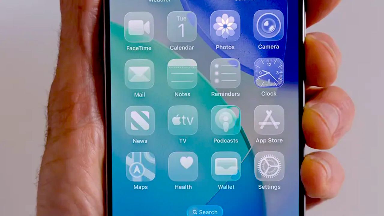
One of the most controversial UI touches was what appeared to be wonky homescreen icons. Although this was ultimately proven to be an optical illusion caused by the new software's motion settings, it was apparent enough to leave several users complaining of feeling "drunk". But with the advent of iOS 27, it seems Apple has decided it's time to sober up.
iOS 27 removes the specular highlights that dynamically react to movement on the Home Screen and Control Center. pic.twitter.com/PiT6nwCXs7June 9, 2026
As reported by Gizmodo's Raymond Wong, one of the loudest voices of the Drunkgate scandal (yeah, I'm calling it that), the first developer beta of iOS 27 has seen the specular highlights removed, so the icons no longer appear to slant to the left.
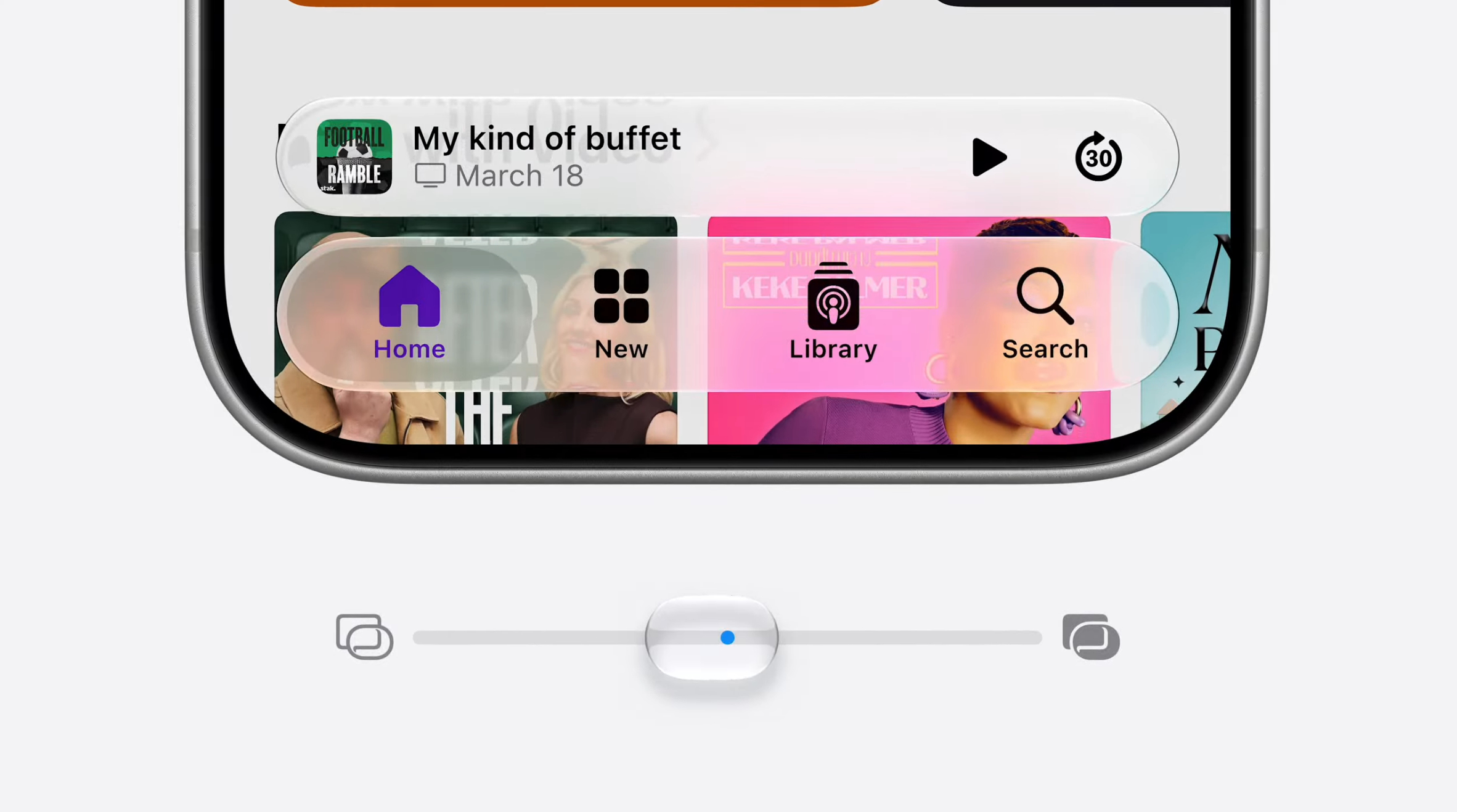
The transparency of Liquid Glass has proven polarising over the last year, to the point that Apple was compelled to add an option for users to reduce it in October. And with iOS 27, the company is taking customisability further with a new slider that lets users customise transparency on a much more granular level.